Tags
Related Posts
Share This


Picture This

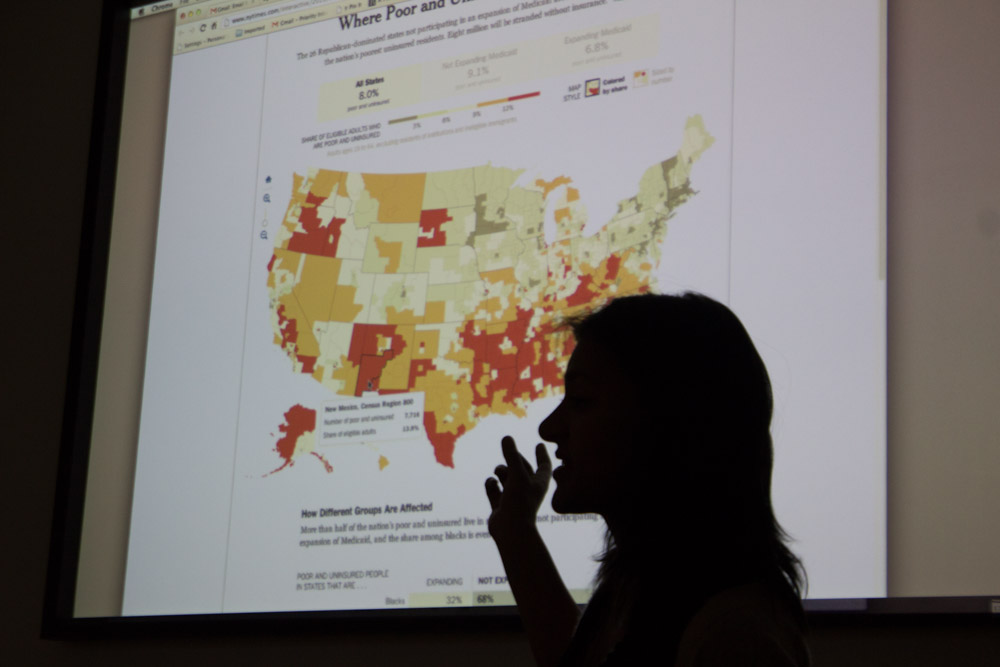
GigaOM editorial producer, Rani Molla.
Photo by Amanda Tyler
“Plain text,” says GigaOM Editorial Producer Rani Molla, “is just not how we think and learn anymore. We don’t memorize—we search. It’s just more efficient.”
There are many ways to share and receive information, and Molla works in the visual realm of storytelling. Molla’s jobs range from helping co-workers post and arrange photos, to writing about design and how to access information visually, to creating data visualizations that help make statistics more reader-friendly and accessible.

“Plain text,” says Rani Molla, “is just not how we think and learn anymore. We don’t memorize–we search.”
Photo by Amanda Tyler
“From a photograph,” explains Molla, “we can infer an entire story.” Molla finds ways to visually represent information so that it is as interesting and engaging as a photograph. By showing statistics in chart, graph or diagram form, she makes data more approachable. It is often faster and easier to take information in visually than to sit down in front of a block of text that explains data through writing. Writing is still absolutely important—it provides analysis for the visual information—but having a comprehensible representation of the hard facts being analyzed can only benefit a written story.
“Nobody can argue with numbers,” says Molla, “they’re objective—so if you can tell the story behind the numbers in a comprehensible way… that’s so exciting!”
Diagrams and charts—especially when made interactive—can also make information more personally applicable to a viewer. If readers hover their mouses over a map to receive place-specific statistics, the numbers might carry more weight than if they just hear a national average. The interactivity of maps and charts is another way for people to easily engage with news and information.
The interactivity of maps and charts is another way for people to easily engage with news and information.
Photo by Amanda Tyler
Still, even numbers can be presented in un-objective ways. Telling stories through charts and graphs is, like all narrative, about perspective. One study, published in The Washington Post, shows a notable increase in Netflix usage in the United States since the government shutdown, implying that government officials have been sitting at home watching movies since the shutdown. Molla reveals the danger of reading data representations that don’t show enough information by pulling up another graph of Netflix usage since November, 2012. Juxtaposing the two graphs clarifies the situation. The increase in Netflix usage in the past few weeks is one of many spikes the company has experienced in a long-term steady rise full of dramatic rises and drops throughout the steady escalation.
Just as with any form of storytelling, transparency is important to making a story as true as possible. “If data has been simplified,” says Molla, “explain how. Make a note below the graph or diagram or whatever visual representation you are using.” At the same time, it is important for “readers” to remember that as much as numbers are objective, it is always possible to manipulate them. “Be skeptical,” advises Molla, “be skeptical of everything.”
Another universal rule that carries into data visualization as a form of storytelling seems obvious: have something interesting to say. No matter how slick a diagram is, “a bad story still sucks,” says Molla. “I am so sick of watching boring videos that people make just because they have a camera. Once you have an idea, with all of its knuts and bolts in place, then you figure out the best way to tell that story.”
Molla, who worked at The Santa Fe Reporter after college, recalls a weekly Q&A column that “everybody had begun to dread because the format was the same every week: We had a picture of the person being interviewed on the left side of the page, and a column of questions and answers on the right.” It was decided that, every week, the format of the Q&A section had to change. “Not only did this make the column more interesting,” explains Molla, “it got me to thinking about how every story has a different match—the perfect way to tell it.” One week Molla wrote her interviewee’s answers in pink. It was a simple change, but it matched the character of the piece. “It’s like a favorite food,” she says. “It’s subjective to each person, but to them that food is perfect; it’s the same with stories, and just that one way that they want to be told.”

“It’s like a favorite food,” says Molla. “It’s subjective to each person, but to them that food is perfect; it’s the same with stories, and just that one way that they want to be told.”
Photo by Amanda Tyler
Rani Molla was a guest speaker in The Jackalope class on Oct. 8.
 Jackalope Magazine is the student magazine of Santa Fe University of Art and Design. Building on the interdisciplinary nature of our education, we aim to showcase the talent of our university and character of our city.
This woman is truly amazing I was blown away reading about her!
Steven D. Austin
Chief Marketing Officer
Zacks Investment Research