
Tags
Related Posts
Share This


Tomes
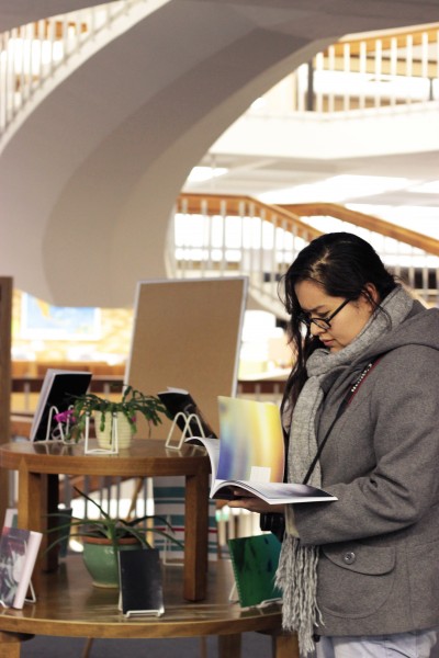
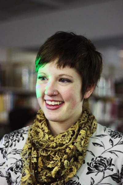
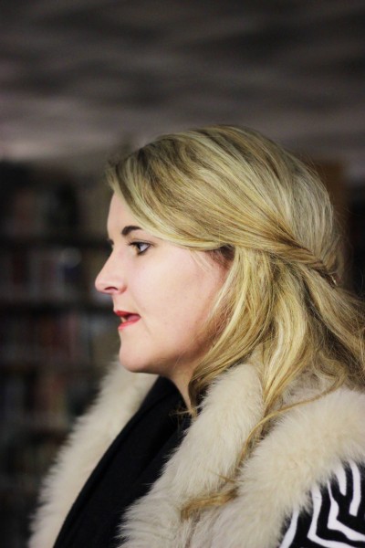
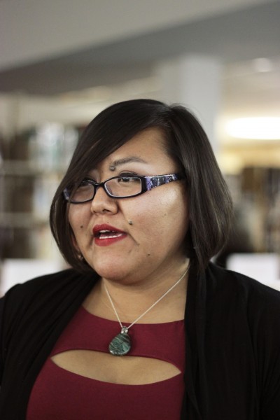
On Dec. 5, David Grey’s Graphic Design IV class displayed TOMES, a final class curation of print and design. According to graphic design major and Jackalope contributor Sandra Schoenenstein, the task of Grey’s class was to gather art and text to support a chosen theme, anything from lingerie to fishing, then design every inch of every page of a final book. The results were staggeringly professional. Let me put it this way, if it wasn’t for the gallery label, I would have thought I was attending a book release. The finals were printed and bound by various means and a majority of the curated work included the designer’s own photography. Read below for some student commentary from David Grey’s 2013 Fall Graphic Design IV.
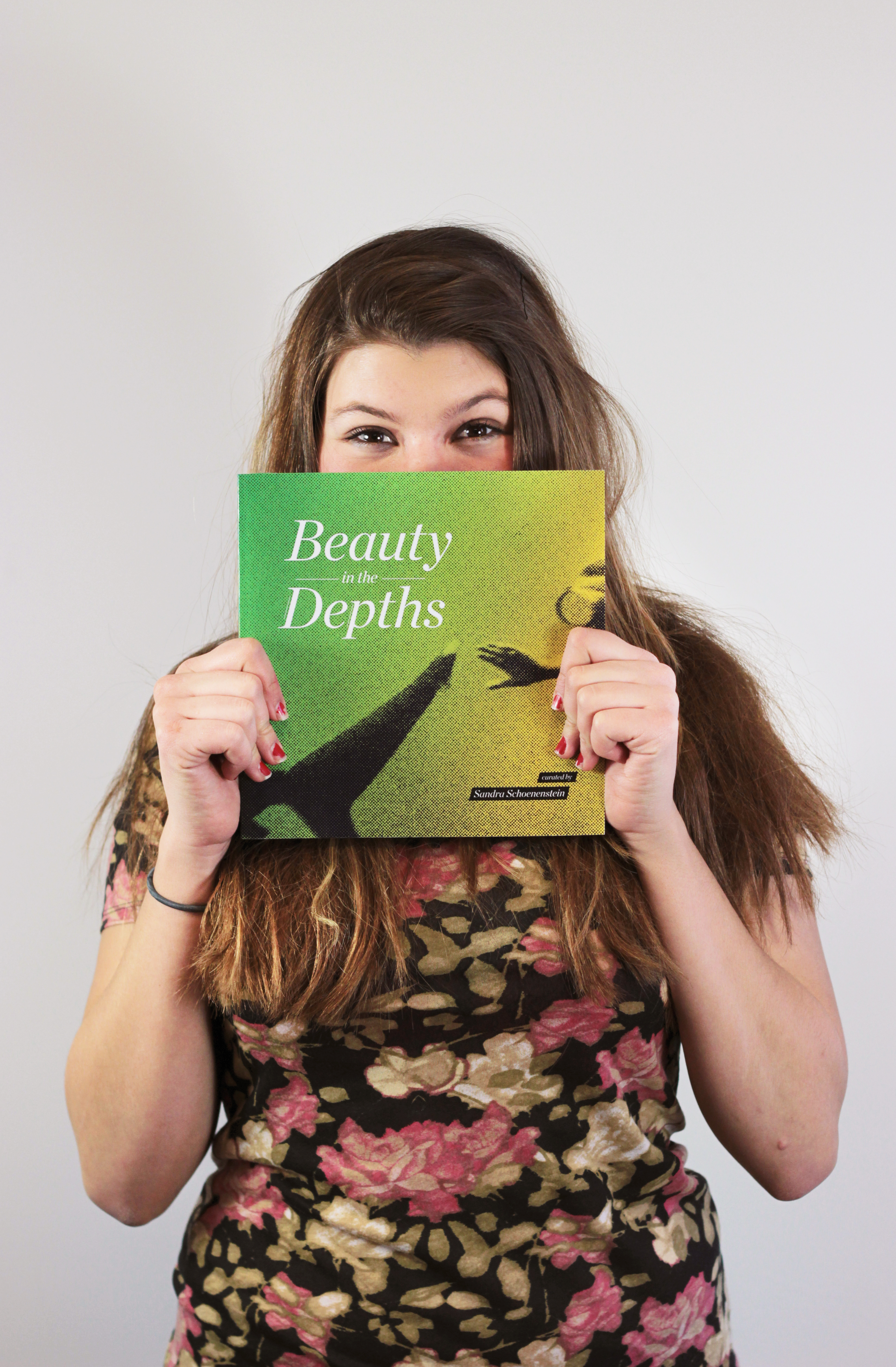
“Beauty in Depths,” curated by Sandra Schoenenstein
Sandra Schoenenstein really likes the ocean and nature, but observes that “humans have been disconnected from it and are always seeing what they want instead of what they already have.” According to Schoenenstein’s text in her book, “Beauty in Depths,” the ocean is like a planet within a planet. “A lot of people depend on it,” Schoenenstein says, “and it’s really beautiful.” Her book is broken into three sections: creatures of the ocean, explorers and problems occurring now as a result of pollution and some solutions to those problems.
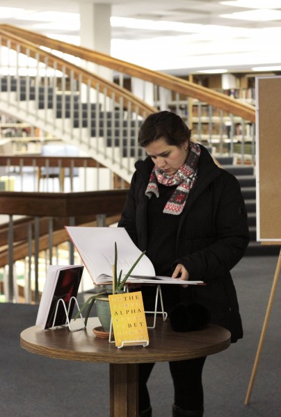
“The Alphabet,” curated by Aldo Vidrio
Aldo Vidrio believes that text itself is an experimentation and says “it’s really good to understand the form and history behind each letter.” Despite four months of hard work and dedication to the subject, Vidrio says the topic of the alphabet is the opposite of what he is actually interested in. He works 3D, Vidrio explains, and is uncomfortable in text, but he found that in researching typography, symbolism and letters, he was able to face his fear of the English alphabet.

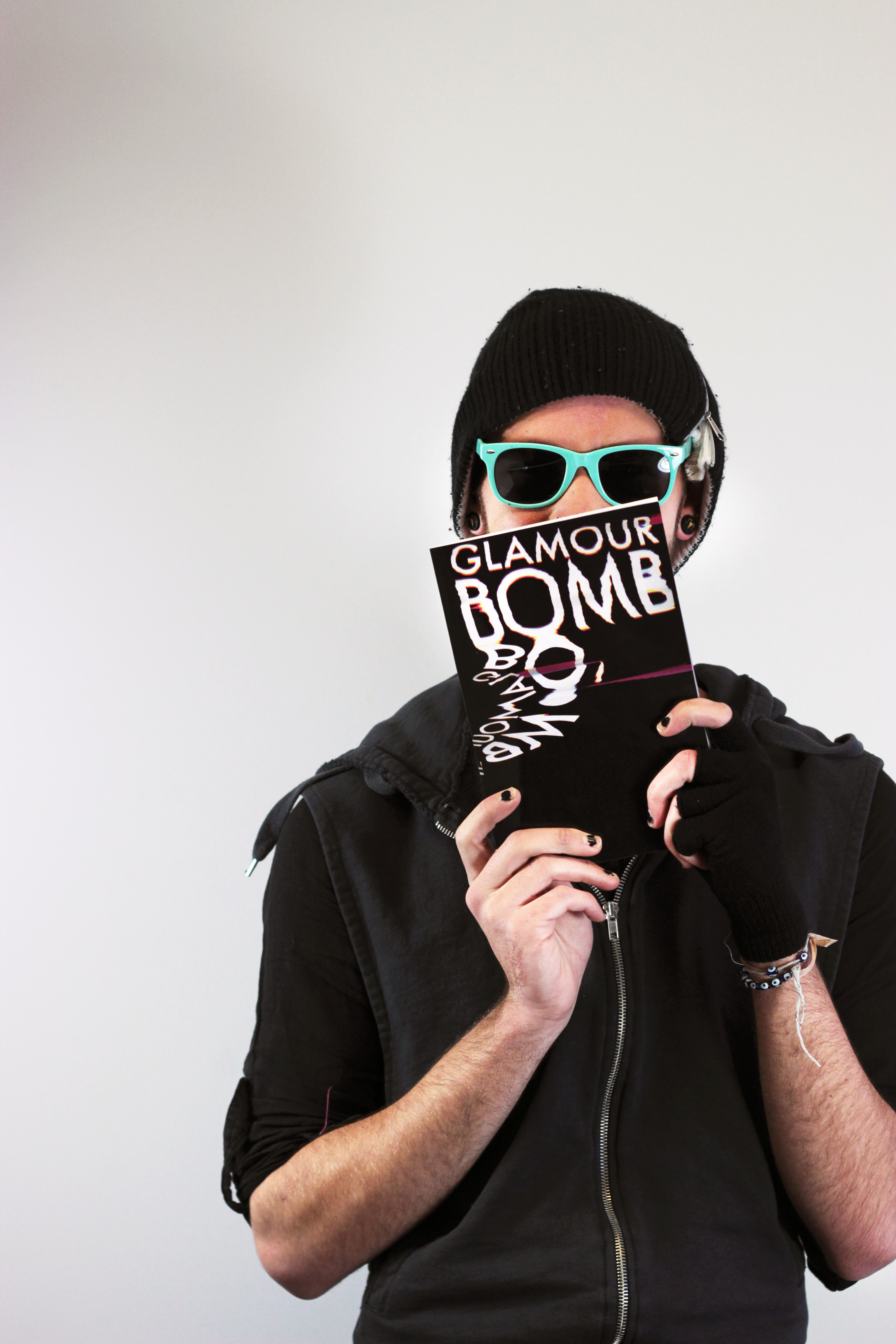
“Glamour Bomb,” curated by Craig Mortensen.
Craig Mortensen says that he doesn’t know where his idea of the “Glamour Bomb” began, but he did know he was interested in pop culture and fairy lore. He started there. After endless media searching and heart-throbbing insight, Craig would integrate “big bright sparkly shit” into his book. It ended up being a “commentary on pop culture, about turning something into something else,” Mortensen says. As the Urban Dictionary defines glamour bombing, Mortensen’s “poetic terrorism” of collage, picture and text was indeed a bombardment of culture, media and magic.
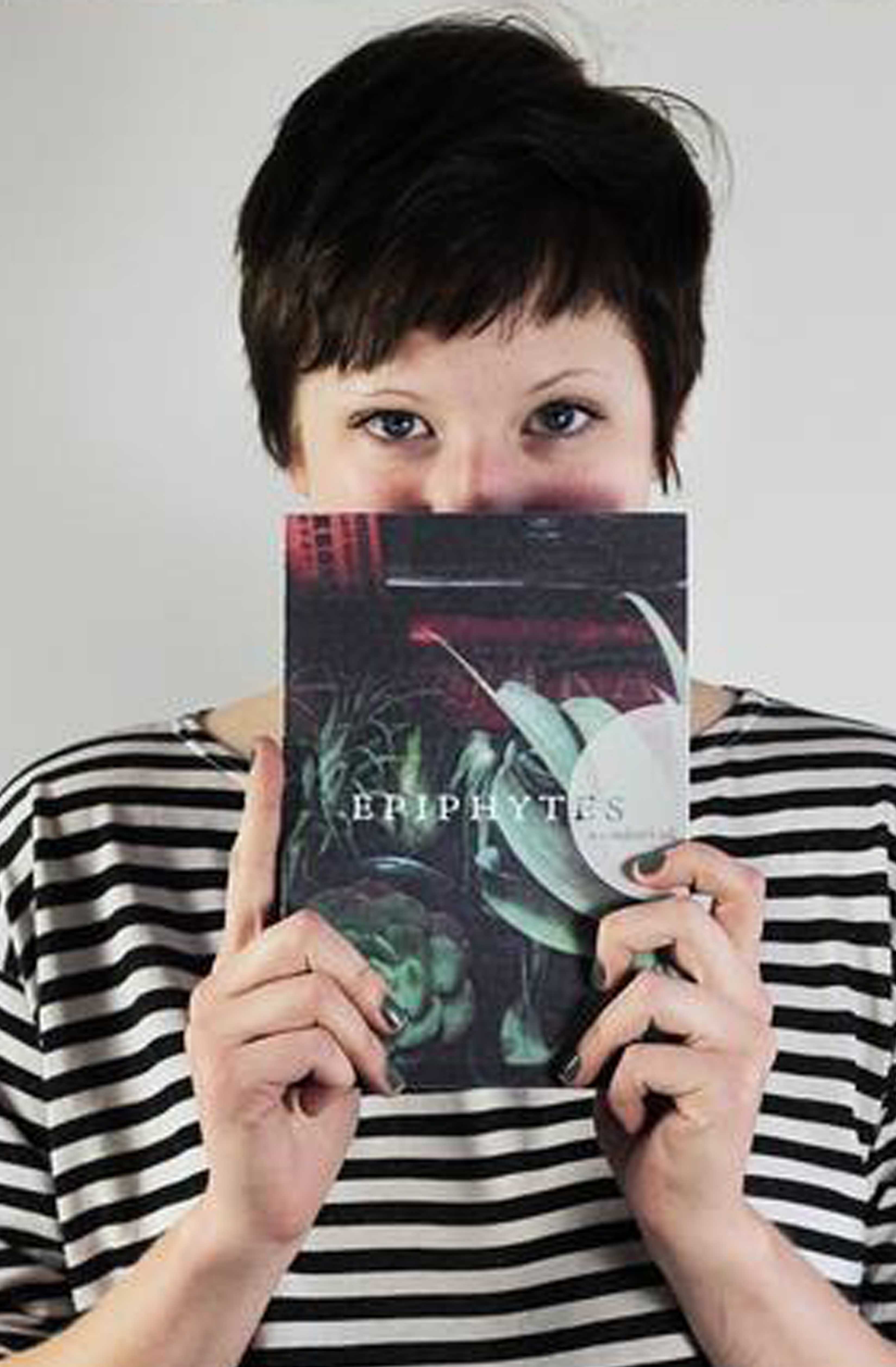
“Epiphytes, a Wanderer’s Tale,” curated by Nina Larson
Nina Larson, a previous writing major, suitably designed her book around her poetry and felt that its “quiet and peaceful” tone encompasses what books are all about. Though she believes books are slowly dying, Larson says “that makes them more free to be art.”
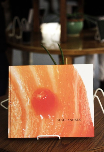
“Sushi and Sex,” curated by Montana Currie
Montana Currie shares that her theme of sushi and sex was fueled by Craigslist. “When you read the personal ads, like a history about sushi,” Currie says, “your mind is in a dirty place already so you start reading it that way.” She went from there. It helped, Currie explains, that she used to be a sushi chef and that she could use her own photography in her book, which is bound in a hard cover. The photos, let’s say, are important in visual interpretation.

“The Catch, On Fishing,” curated by Hannah Selman
Hannah Selman’s book starts with the backstory of fishing, then ends with fishing as recreation. “A lot of people think fishing is boring so I try to make it un-boring,” Selman says. The subject is especially close to her because she did a lot of fishing with her dad. “I’m excited to show him when I get home,” Selman says in anticipation of the coming holiday break.

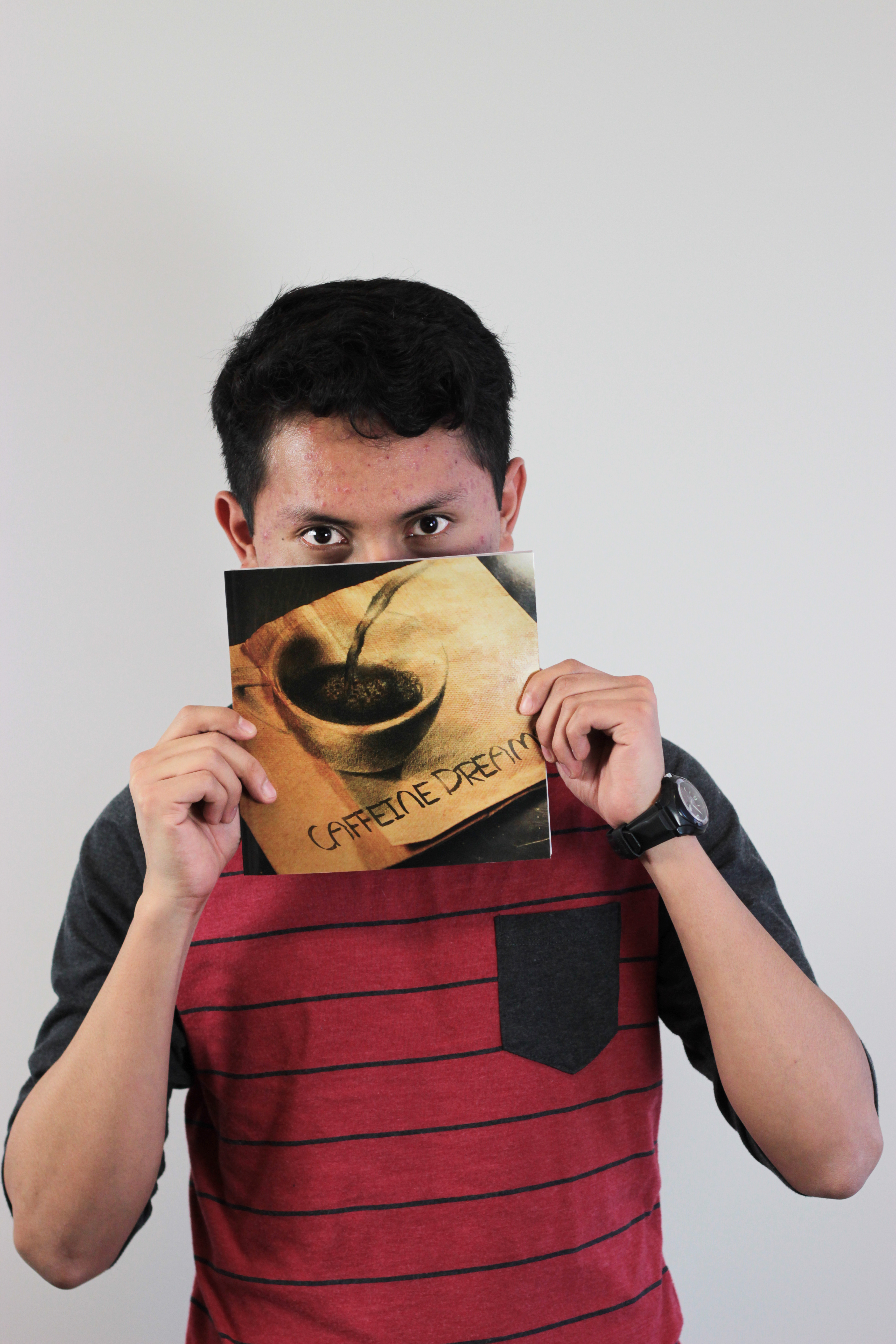
“Caffeine Dreams, Coffee Inspired Art from the Globe,” curated by Arnold Mateos
“It’s about coffee but then again it has nothing to do with coffee,” says Arnold Mateo. “It’s coffee-inspired art like music, clothes, coffee paint, coffee shops.” As a curator, Mateo explains that he was sure to respect the text and photos of his outside sources, but excited to use his own photo for the cover page, as well as some photos provided by his older brother. The overall earthy color scheme and bean-like atmosphere makes you feel like your sitting in an elegant cafe.
“Two Cups,” curated by Tiffany Bah Charley
Tiffany Charley was talking with one her friends about shopping for bras and she thought about how “a lot women like to wear sexy bras under their clothes,” even though no one can see them. It was then Charley decided she was going to do a book about bras, about bringing out the “secret hidden beneath,” as her printed commentary reads. For Charley, this meant finding a variety of bras for her models to wear, then photographing them and displaying them coherently in a book.

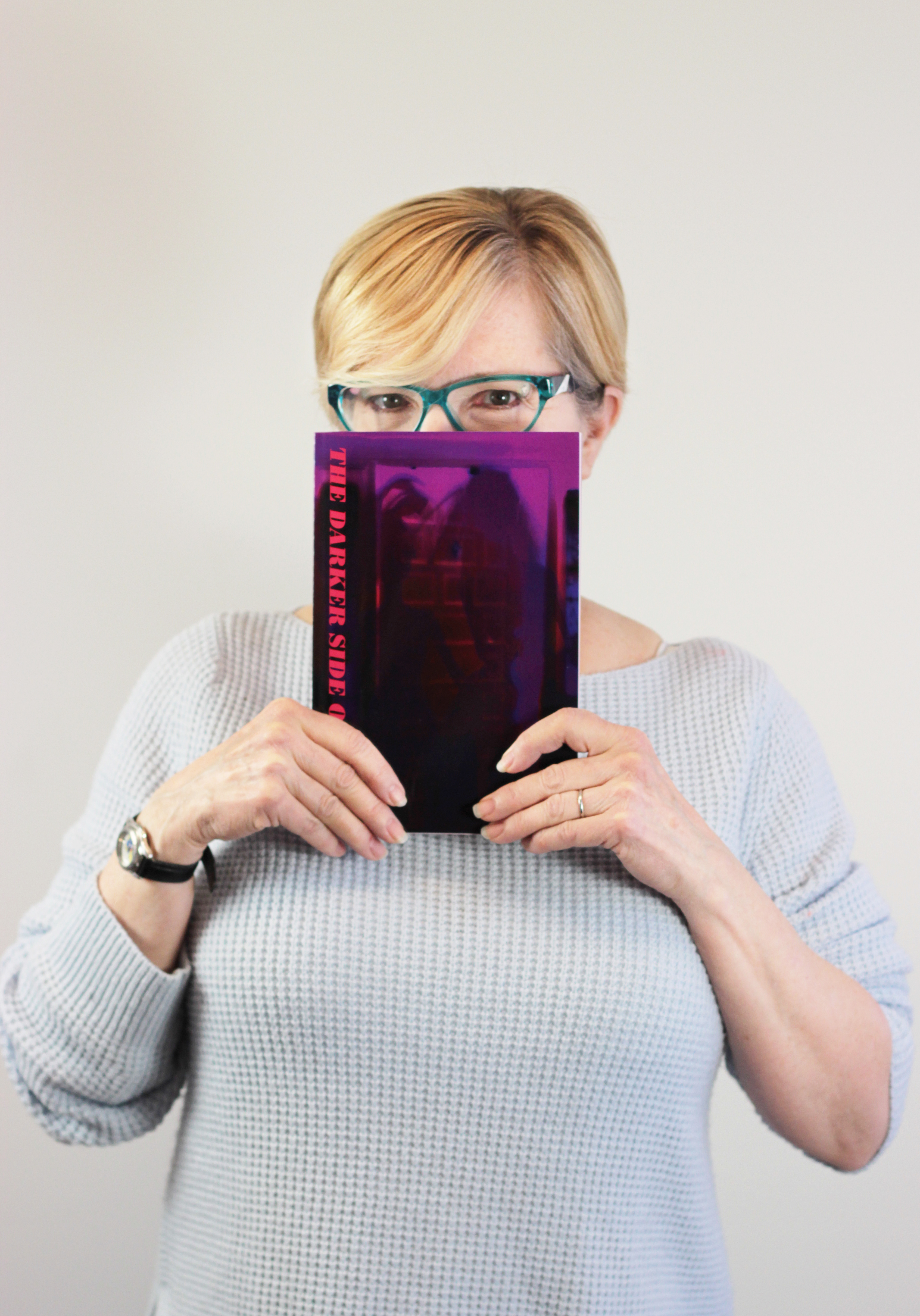
“The Darker Side of Pink,” curated by Patricia L. Ballard
“It’s about the commercialization of the color pink in our culture,” Patricia Ballard says, and how the colors pink and blue came to define girls and boys. “I didn’t like girls being pushed into that princess thing…and studies have found that a lot of boys liked pink so it’s kind of a disadvantage that they’ve channeled them through the color blue.” The second half of Ballard’s book deals with the breast cancer culture and “the selling of pink.” Ballard herself was treated for breast cancer and was interested in the ways foundations like National Breast Cancer Foundation were using their donated money. “Think before you pink,” Ballard says, describing the slogan that warns the public of the very real scams present in consumerism fundraising.
 Jackalope Magazine is the student magazine of Santa Fe University of Art and Design. Building on the interdisciplinary nature of our education, we aim to showcase the talent of our university and character of our city.
Recent Comments