Tags
Related Posts
Share This


Donna Ruff: Printmaker
Story by Brandon Ghigliotty/Photos by Shayla Blatchford
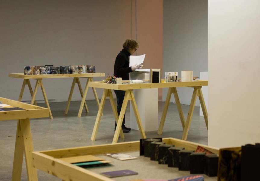

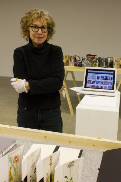
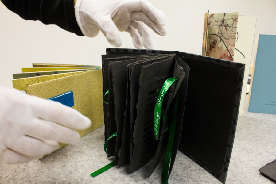
I had the opportunity to interview Donna Ruff, printmaker, illustrator and Art Department faculty member of nearly two years at Santa Fe University of Art and Design. Ruff, with an MFA from Rutgers, has more than a decade of teaching experience spread throughout New England. On a late Sunday morning, openings in our schedules converge to allow me to get to know more about her work.
What drew you to printmaking as a medium?
Donna Ruff: Rutgers has an important printmaking department. At the time they had the Rutgers Center for Innovative Print and Paper, but it’s now called the Brodsky Center, after one of my professors, Judith Brodsky. They bring in artists from New Jersey and New York on grant programs to do projects in printmaking, with papermaking as an element if the artist wants to do that. I had professors who were well known in that field—besides Judy, I had Lynne Allen as a professor. She was a master printer at Tamarind at UNM for years and we discovered we had mutual friends in Albuquerque. I had never tried lithography—it seemed quite daunting, as it involves some alchemy—the print results from oil and water not mixing, and is planographic. So there are a lot of ways it can become a big mess on the plate. I was an older student and Lynne took me in the darkroom and showed me how to make a photographic litho, which changed my work in a huge way. I also learned to make paper, and understand its particular qualities. Printmaking departments, even at Rutgers, are having a hard time holding on. It’s thought of as too “old school” or something. Colleges are scrambling to build New Media departments, and printmaking requires too much room and maintenance.
Your professors seem to have had quite the impact on you. Is that the kind of impact you want to have on your students? I’m always confused by ‘teaching art, but it seems to be more hands-on than I imagined.
DR: I think professors can have a huge impact, both positive and negative. For instance, because I had been an illustrator and was at a school that stressed conceptual art, I was told never to tell people I’d been an illustrator. Illustration meant commercial art and commercial art was frowned upon at that point. Since then, illustration has become very much part of the conversation in art, as has craft and design. The boundaries are completely porous, but they weren’t back then.
I teach freshmen at SFUAD and I don’t have a chance to see them through their discoveries of their artistic voice. I see the glimpses of it in their work and who they are, and I can try to steer them. But honestly I think our job as Freshman Studio instructors is to help them learn to think differently than they have been before they came to school. These students have been rewarded for their talent by their families and teachers, but often they come in with strong ideas that might be a little clichéd, or academic. I hope that I can get them to think in a broader way about what an art practice might look like. We have wonderful students—I enjoy their work tremendously, and as professors, we get as much from our students as we give to them.
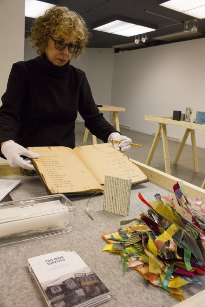
I’d like to know more about your process. I looked at the New York Times pieces in particular and they seem very meticulously crafted.
DR: Yes, most of my work involves meticulous labor, but I enjoy that. I guess I’m a bit of a control freak. It’s not true of everything I do, but a lot of my work is in my head before I begin to make it. For the NYT pieces, I work out the patterns first on the computer, print them out, then use them as a template by cutting through both the computer print out and the newspaper at the same time. But I’m always looking at what I’m cutting out and what I’m leaving; how the shapes interact with the page; what the edges should be. There are many decisions that I make along the way. If I cut too much, the piece is ruined. So I tend to try to cut too little, and then I can always take more out.
I’ve shown these works framed and mounted on shelves. I’m always trying to use paper in a way that connects with space and that the viewer can interact with. Being on low shelves, people can take a moment to look closely, as if they are actually reading the newspaper or looking at a book.
I have read about your inspiration from sacred texts. Is this purely aesthetic? The way you describe the labor in your work seems as though it falls into ritual at times. I think anything requiring that much focus might.
DR: Yes, it does fall into ritual or meditation in a way. I’m very interested in language, in particular in written language. I saw an exhibition of Islamic calligraphy a few years ago at the Asia Society in New York. There were handmade pens that were incredibly elaborate, and the calligraphy was so varied and beautiful. Islam and Judaism both have a reverence for the book and for writing. If you think about it, Moses was given the written law by God—and in Islam, the Qu’ran was dictated to Muhammed by Allah. Writing is thought of as a sacred act—that’s why the pens are so carefully crafted. A scribe is thought to be connected to Allah as he writes. I don’t say this to elevate what I’m doing to a religious act, but I do find it interesting to think about how art and spirit are related.
 Jackalope Magazine is the student magazine of Santa Fe University of Art and Design. Building on the interdisciplinary nature of our education, we aim to showcase the talent of our university and character of our city.