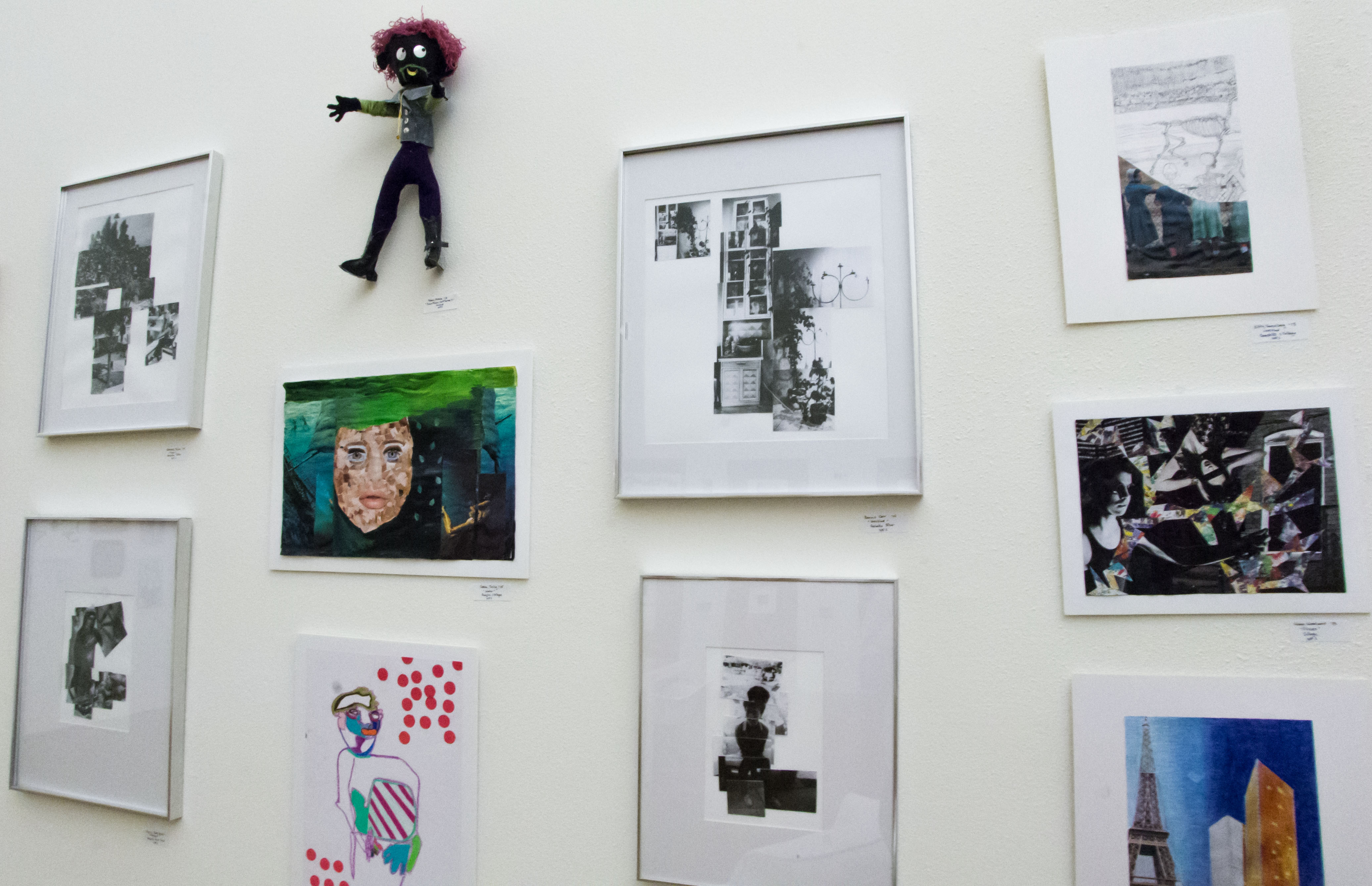
“We didn’t want to curate something that seemed like an exhibition,” Luke Dorman explained in defense of his process curating Harvest, the studio art department’s 2nd annual juried art show. Dorman, along with Kelsy Waggaman, both graduates of the College of Santa Fe, were selected to judge and curate Harvest. On Thursday, Oct. 17, the two sat down for an open talk with anyone interested in learning more about their approach to the show. “The exhibition of the rejects,” or Salon de Refuses, is the first cluster of artwork seen when stepping into Fine Arts Gallery in the Southwest Annex. The salon, which was located in the rear of the exhibition during last year’s show, presents all of the works that were submitted to Harvest, but not accepted. The walls are filled with vibrant pieces of each artist’s individual talent, differing in both mediums and subject matter, but aesthetically stimulating when packed so closely together. They fool you into thinking that this is the show you came to see and, judging by the placement and variety in artwork, it is not that much of a stretch. You begin to realize then, after moving a little further into the room, that the selections that have been individually chosen and praised by the jurors are yet to come. The focus shifts from everything at once to one at a time. The 12 pieces selected were given room to breathe between one another with not a single exhibit resembling the next, yet they were all somehow related. You’ve already been shown the works that didn’t work together with all of the variables that go into a juried show, so you can gather that these pieces are meaningful and are all speaking to you thematically. In response to a student’s question asking if a specific theme was apparent to her and Dorman, Waggaman emphasized the importance of the viewer’s response rather than the jurors’ intent. “Do you see a theme?” she posed. At the Q&A with the jurors, students and faculty members, the majority of questions of which were centered around the purpose of the show, its layout in the space and the jurors’ ideas on juried shows in general. Dorman and Waggaman both agreed that, as former art students, it was difficult for them to say “no” to certain pieces that were truly remarkable by themselves, but didn’t work well next to other pieces. Waggaman described acceptance into the Salon as “a different kind of pride.” She also said that whenever her work wasn’t accepted to shows, she learned the most from those failures and it showed her how to improve her work for the next time. From embroidered shoes/socks on paper plates to a mimetic painting of two feuding foxes, all of the pieces in Harvest and the Salon played together to create a sense of place and acceptance. Both jurors worked independently at first in order to decide which ones they liked personally, then came together and collaborated with each other’s favorites. This bonding of different minds formed a cohesive collection of artwork that somehow worked together—despite lacking a specific...
The Murk of Memory
posted by Brandon Ghigliotty
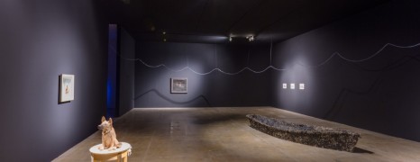
Enrique Martinez Celaya transformed nearly 12,000 feet of gallery space into an autobiographical journey at SITE Santa Fe. “The Pearl” spoke of loneliness, longing and and a troubled relationship to the landscape. Both through absence and explicitness, the work conjured the turmoil of memory. Pushing past the entryway of the installation, the gallery-goer confronts the image of a German Shepherd eating a house-shaped block of meat. Hideous baby laughter bleats out intermittently as the canine devours its meal from the plate. The image was projected on thick canvas blinds that concealed the next part of the journey. Once the canvas curtains hosting The Guardian are navigated, a small window appears on the left, giving a glimpse of the future experience ahead. The space opened up to 24 Casuarina pines leaning against the walls. Small nubs jutted from the tree trunks where the branches have been stripped off. The Forest (or The Others) borders an area enveloped with the cacophony of surging waves and tinkling piano music. A thin ribbon of tubing hung from the ceiling and served as a trail of breadcrumbs leading further into fantasy. A carved statuette of a German Shepherd, its neck betraying its role as a cookie jar, greeted visitors to the room that seeped piano music. The cookie jar’s table was relatively unmarred, with a diminutive ash-splotched unicorn attached to its side. The music, Martinez Celaya’s first composition, sprang from The Stone and the Air, a kitsch-littered old Zenith radio. Twelve porcelain songbirds rested on the radio and walnut shelf, reminiscent of a warm, distant memory. The Short Journey was a rowboat that rested at the center of the room, tarred and feathered, containing a glimmering, toppled lighthouse. Water, possibly taken on during its journey, pooled in the bottom of the rowboat. The Table, a charred dining set, brooded against The Ocean, a projected backdrop of black and white waves. At the center of the dining table was a bejeweled elephant, which, through stubbornness or ignorance, flaunted its opulence against the tragic setting and crashing waves. The tubing continued to an immense space occupied by two paintings staring at each other past a weeping, jewel-studded boy. The first painting, The Dock, depicted three swimwear-clad boys on a pier. The nearest boy looked down the pier at the pair of other boys, one squatting while the other returned the onlooker’s gaze. The painting projects sadness, alienation and longing, although a gallery attendant offered the interpretation that depicts Celaya at different points in his life. Reconciling the two reveals a composite characterization of Celaya’s loneliness. The Separate Cascade slouched at the center of the room, weeping into The Fountain, a pine needle-laden trough that narrowed and snaked out of sight. Moving through the impressive space created distance from the bawling child, a passage of time accentuated by the trickle of water. Then, The New Comer came into view. An uncertain young boy reached out to a smattering of flowers as a hummingbird watched on. “This is where I made my stand” was scrawled along the bottom of the scene. The trough ducked into a room that contained The North, a raw plywood house spewing stars through its roof. The night sky ceiling dripped into walls sprinkled with dozens of taxidermied cotton butterflies–petite cut-outs–interrupted by the sheets from which they were clipped, which gave the illusion of jet-black butterflies through the wounds. The butterfly-infested walls spilled out to a shining white room shrill with songbirds. The Better Place consisted of a labored machine gasping into a set of lungs that floated on a gleaming pond, while a stuffed fox stood amongst a pine tree setting taking in the scene. The asthmatic, desperate child that was Enrique Martinez Celaya brought the observer along with him on his journey through “The Pearl.” A journey through the stirred murk of memory. Photos by Eric Swanson, courtesy of SITE Santa Fe....
Navigable Obstacles
posted by Brandon Ghigliotty
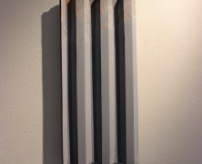
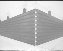
Tom Miller’s first exhibition at Zane Bennett Contemporary Art, Walling: Containing Architecture challenges the difficulties imposed by framing and claiming space, as well the implications of division. Perspective shifts from one side of the barrier to the other: On one side, hope and possibility; and on the other, denial and entropy. “Long Wall with Fix,” a floor sculpture that dominates the entrance of Zane Bennett Contemporary Art, bisects the cracked, striated concrete floor. Gallery goers navigated the wall in their own way, with many simply reaching over to shake Miller’s hand, rather than work their way around. This is an intended consequence and a result of Miller’s desire to thematically enact walling and distance through a barrier installation. Throughout the night, people seemed to gather on the side of the wall that faced the entrance. Its white face interrupted by raw plywood patchwork near the top. The front starkly contrasts the rear, its naval-gray neutral hue and tank trap trusses evident and imposing. One side stands clean, welcoming and projecting perfection, while the other feels militarized and built to task. The same materials—plywood, resin and paint—crafted for different evocative purposes. The work weaves through the gallery. A narrow stretch of hallway holds work that lies vertical in opposition to the long horizontal hall. Just before the path turns the hallway, “New Standard” appears. The perspective of the painting denotes two symmetrical swathes pulling away from the center, and each other, threatening to creep from its canvas and wrap around its privileged space. “Small Tower“ marks the beginning of the hall, both obstacle and observation tower, with a peg leg repair that replaces one of the four feet it rested upon. In the hall, a piece known as “Slice“ beckons observers closer. “Slice’s” top shows marred, exposed wood—forgotten or...
Art Infusion
posted by Brandon Ghigliotty
The Fall 2013 semester is bustling with events and the art department is no different. Three events draw near: faculty member Tom Miller’s exhibition at Zane Bennett Contemporary Art, Enrique Martinez Celaya’s lecture in Tipton Hall and hARvesT, the 2nd annual juried exhibition. Tom Miller’s exhibition, Walling: Containing Architecture, looks to challenge the role of barriers in society. Miller’s concern lead him to a body of work that navigates the notions of transition and perspective. The show features an installed wall centerpiece measuring 24 feet in length. Its front—a stark, neutral white—contrasts sharply with the worn back, which reveals supports reminiscent of tank traps. Miller was worried about being limited to painting when he entered graduate school. “With sculpture I could do anything,” said Miller. On Oct. 1, Enrique Martinez Celaya comes to campus for a lecture in Tipton Hall. Martinez Celaya, a Cuban American artist, is responsible for shaping nearly 12,000 feet of gallery space at SITE Santa Fe. According to Martinez Celaya’s biography, he was pursuing his doctorate in quantum physics before shifting his focus to the art he practiced in his spare time. Given the gestures of reclamation within Martinez Celaya SITE Santa Fe exhibition, it would be a great opportunity to ask questions such as, “I read something in your biography about laser patents. What the hell, man?” The lecture is a collaborative effort between SITE Santa Fe and Santa Fe University of Art and Design. Linda Swanson, chair of the art department, discussed the relationship between SITE Santa Fe and the university. Such as the opportunities afforded by internships and the benefit of having Joanne Lefrak, director of education and outreach, engaging with the students in the classroom. “I think of them as one of the institutions that expands...
Spraypaint + Vision
posted by Amanda Tyler
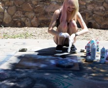
By Amanda Tyler Kyleigh Carter sits in the morning sun, contemplating the blank sheet of paper before her as she draws inspiration for her current piece of artwork. “The scene where Elizabeth almost jumps overboard to save her father,” she thinks aloud, referring to a scene from Pirates of the Caribbean in which a full moon glows somberly in the night...
SFUAD at SITE
posted by admin
In Spring, 2013, students from the Jackalope pre-cursor class Collaborations toured several exhibits at Site Santa Fe, producing writing and photography that was then published by SITE as a gallery guide. View the guide online here. Photography student Sandra Schonenstein also created an audio visual piece interview with SITE intern Diana Padilla: And photography student Shayla Blatchford also created an audio visual piece with Linda Mary Montano, whose show, “Always Creative,” was part of the SITE...
Al-Mutanabbi Street: A Desecrated Tome
posted by Brandon Ghigliotty
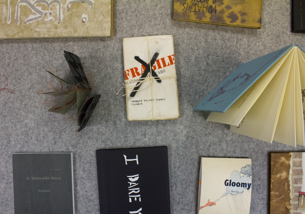
By Brandon Ghigliotty/Photos by Shayla Blatchford On March 5, 2007, a dagger pierced through the intellectual heart of Baghdad: Al-Mutannabi Street, known for its cafes and bookshops, was bombed. The motivations of the people responsible for this are clear: silence the vehicle of Iraqi expression. The response from Beau Beausoleil, a San Francisco-based poet and bookseller, was to organize a salvo of broadsides, defiant posters proclaiming, “The past is our culture/Remember our future” and “Al-Mutanabbi Street is a phoenix that will be reborn from the ashes.” The call for broadsides was answered by more than 130 printers worldwide. The exhibition entitled “Al-Mutanabbi Street Starts Here” opened Friday Feb. 8, featuring work from local Santa Fe artists Lauren Camp, Donna Ruff and Suzanne Vilmain. Some of the work in the exhibition sits peeled and charred – another lies in a heap of scrap paper strips. The pieces are spread out on elevated platforms like forensic evidence. A piece by Julie Shaw Lutts entitled “Remembrance” is a set of three lengths of accordion fold associative poetry. Each section has its own name: pain, grief or recovery; and draws from the starting word to push through the work. For Linda Swanson, chair of the art department, having the university included in the tour “means we are now part of this community that’s thinking about this. It’s now in the foreground and has a powerful insistence that we don’t turn away.” Five years after this particular bombing took place, the momentum of the outcry still presses onward with touring dates into 2015. For Donna Ruff, the turnout for the exhibition’s opening was “great for a Friday in Santa Fe” adding that “it’s not about an arts show, it’s about being a witness to an event.” For Linda Swanson, the exhibition is not through with what it has to offer. “It’s organic, it is a living exhibition with a pulse.” Organic is the perfect way to describe the project, as there are already talks of including work from SFUAD students on future stops. “Al-Mutanabbi Street Starts Here” makes a concerted effort to bring attention to the plight of artists and thinkers in a part of the world that has the greatest need for literature, poetry and culture. It is optimistic to think that art could act as the styptic powder for the wounds of a war-torn nation. The problem remains: the source of Mutanabbi Street’s rending still exists and ignorance is their armor against the efforts of the exhibition. ...
Monte Del Sol student work on display at SFUAD...
posted by Arianna Sullivan
By Arianna Sullivan/Photos by Natalie Abel The Marion Center is alive with a plethora of energy when I enter. A group of Monte del Sol Charter School students grouped in the corner of the main gallery sing energetically, accompanied by an electric keyboard. The walls are filled, seemingly top to bottom, with an eclectic mix of different mediums—from photography to 3-D dolls—all a product of the spirited Monte del Sol art department, and the efforts of its two key players: Michael Webb and Nancy Sue Michels. The place is absolutely swarming with middle and high school students, Santa Fe University students and faculty, parents of the Monte del Sol students, and even Santa Feans who came to the Marion Center to view the two other shows opening in the space, and then wandered into the charter school’s show with pleasantly surprised looks on their faces. When Natalie and I finally track down Michael and Nancy Sue, they are both buoyant and enthusiastic about the show, and the turn-out for its opening. “This might be the best show we’ve ever had,” they agree, referring to the success of the Marion Center as a space to showcase their students’ work after 13 years of working together to put up an annual show of the student work being created in Monte’s art department. Nancy Sue is excited, she explains, by the energy that is constantly buzzing about the Marion Center Gallery. “Even when we were hanging the show the other day,” she says, “there were people coming through here, going about their business. It’s not like a gallery space that closes up at night and after that nobody sees the artwork. Plus,” she concedes with an almost mischievous smile, “it gives me this little flashback to being...
Art Awaits
posted by Brandon Ghigliotty
Story by Brandon Ghigliotty/Photos by Shayla Blatchford The main lobby of the Thaw Art History building greets me with a faux bathroom. In place of a mirror, a screen plays looped video above its sink. The installation crowds the main lobby and forces visitors into the rest of the building. A large piece beckons at the end of the hallway, a many doored wooden box around five feet tall—its flanks draped in black cloth. Rusty hinges flex while the apparatus behind it ticks and strains. The work in the hallway, part of a joint exhibition entitled Range that will be shared with Universidad del Mar in Chile, continues past the restrooms with the sketch of a tree trunk. The illustration’s color defies the verdant nature of the piece, with its bruised, purple coloration exacerbating the veins of the tree’s trunk. While examining the piece, a figure approaches from my peripheral vision. I shift my weight and scoot out of her way, greeting her. She nearly passes before I recognize her: Linda Swanson, chair of the art department. I begin to introduce myself, but I’m interrupted by her. “If you want to talk, you’ll have to keep up,” she says. I roll to the balls of my feet and spring up after her as she strides down the passageway. Photographer Shayla Blatchford and I follow Swanson to the building’s kitchenette. She multi-tasks while speaking to us. Swanson punches the microwave and trades out mugs, before she splits tubes of instant coffee over them. She tells me about a recent event within the Art Department. Santa Fe University of Art and Design’s Kristaan Villela, who holds a doctorate with an emphasis in Pre-Columbian Art, hosted a lecture on the role of the Apocalypse throughout mankind’s history. The...


 Jackalope Magazine is the student magazine of Santa Fe University of Art and Design. Building on the interdisciplinary nature of our education, we aim to showcase the talent of our university and character of our city.
Recent Comments