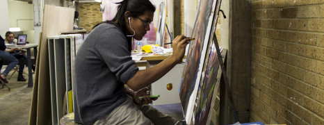
As a community of artists, we often create connections in the spaces where—and the people with whom—we work. Since Manhattan started filming last March, the painters and artists have been moved from their old work space in the Barracks to primarily use as their main painting facility the second story of Alexis Hall, which is predominantly the graphic design building. Jackalope spoke with a few of the artists about their experiences in the new space. Dylan Tenorio, a junior Studio Arts major, considered the new facility a crowded space with low ceilings. “The space can be a bit crowded, and there are a lot of us here sometimes.” Another concern he brought up is that supplies can go missing, which he says was less common in the old facility. He does, however, enjoy having the digital lab downstairs. “Sometimes I go down there and do some digital work; it’s really convenient.” Omar Lazri, also a junior Studio Arts major, really enjoys the facility’s aesthetic. “It has a very eastern New York look with the bricks and the length,” he notes. But he also really misses the Barrack’s higher ceilings, which allowed him to work with taller pieces. He also thinks that the new facility can get too hot when everyone is there working or doing class. Phat Le, a junior Fine Arts major, really misses his old painting space. “I had grown very attached to the old space,” he says. “I worked there all the time.” Le also thinks that the space is very small for his style, but he is learning to work with it for the time being. “I am used to making big artwork and the older space in Tishman was perfect for me.” Ryan Roberson, a Junior Studio Arts major, thinks that the new space has bad lighting and is much more cramped compared to the old facility. She also spoke about not feeling too comfortable leaving her materials out. “I personally don’t like this new space. The other building was much bigger and had much better lighting.” Kevin Bouton-Scott, a first semester Studio Arts major, never knew the other facility. He is a very reclusive artist who enjoys his privacy—and he really enjoys the space in Alexis Hall. “I can stay here all night to work, often I do.” He would simply advocate for the card readers to work after hours so that he can come work more conveniently. He would also like more lockers to contain materials and...
Weather
posted by admin
The weekly Awkward Shelby Comic is created by SFUAD studio art major Shelby Criswell. For more of Criswell’s work, check out the Awkward Shelby Comic series and her Tumblr.
Harvest Season
posted by Nicholas Beckman
“We didn’t want to curate something that seemed like an exhibition,” Luke Dorman explained in defense of his process curating Harvest, the studio art department’s 2nd annual juried art show. Dorman, along with Kelsy Waggaman, both graduates of the College of Santa Fe, were selected to judge and curate Harvest. On Thursday, Oct. 17, the two sat down for an open talk with anyone interested in learning more about their approach to the show. “The exhibition of the rejects,” or Salon de Refuses, is the first cluster of artwork seen when stepping into Fine Arts Gallery in the Southwest Annex. The salon, which was located in the rear of the exhibition during last year’s show, presents all of the works that were submitted to Harvest, but not accepted. The walls are filled with vibrant pieces of each artist’s individual talent, differing in both mediums and subject matter, but aesthetically stimulating when packed so closely together. They fool you into thinking that this is the show you came to see and, judging by the placement and variety in artwork, it is not that much of a stretch. You begin to realize then, after moving a little further into the room, that the selections that have been individually chosen and praised by the jurors are yet to come. The focus shifts from everything at once to one at a time. The 12 pieces selected were given room to breathe between one another with not a single exhibit resembling the next, yet they were all somehow related. You’ve already been shown the works that didn’t work together with all of the variables that go into a juried show, so you can gather that these pieces are meaningful and are all speaking to you thematically. In response to a student’s question asking if a specific theme was apparent to her and Dorman, Waggaman emphasized the importance of the viewer’s response rather than the jurors’ intent. “Do you see a theme?” she posed. At the Q&A with the jurors, students and faculty members, the majority of questions of which were centered around the purpose of the show, its layout in the space and the jurors’ ideas on juried shows in general. Dorman and Waggaman both agreed that, as former art students, it was difficult for them to say “no” to certain pieces that were truly remarkable by themselves, but didn’t work well next to other pieces. Waggaman described acceptance into the Salon as “a different kind of pride.” She also said that whenever her work wasn’t accepted to shows, she learned the most from those failures and it showed her how to improve her work for the next time. From embroidered shoes/socks on paper plates to a mimetic painting of two feuding foxes, all of the pieces in Harvest and the Salon played together to create a sense of place and acceptance. Both jurors worked independently at first in order to decide which ones they liked personally, then came together and collaborated with each other’s favorites. This bonding of different minds formed a cohesive collection of artwork that somehow worked together—despite lacking a specific...


 Jackalope Magazine is the student magazine of Santa Fe University of Art and Design. Building on the interdisciplinary nature of our education, we aim to showcase the talent of our university and character of our city.
Recent Comments